Okay friend, if you’re here it probably means you want to try exterior home color schemes for beginners without feeling totally overwhelmed, and I am so here for it. Picking colors used to freak me out until I learned a few simple rules that make it actually fun instead of scary.
I wrote this because I remember staring at paint chips for hours, so I tested easy combos on houses, doors, and trims until I found what really works – and I want to share what I learned in a very human, not-too-design-school way. You’ll get straightforward ideas, real-life tips, and little nudges to help you pick with confidence.
Scroll through these 15 simple looks, and by the end you’ll have a handful of palettes you actually want to live with and the steps to try them yourself.
These 15 exterior home color schemes for beginners to try
Soft Gray with Crisp Trim
Soft gray paired with bright white trim is a calm classic that almost never goes wrong. I painted my little bungalow a similar hue last spring and neighbors actually stopped to compliment it on walks. Consider adding stone steps or natural wood finishes for warmth and texture so the palette feels intentional rather than flat. If you want low-maintenance, pick a mid-tone gray that hides dirt but still reads as fresh from the street.
Blue Siding, Bold Red Door
Blue siding with a red front door feels playful and welcoming without being fussy. I almost chose a yellow door once, but the red gave the whole house an unexpected pop that made me smile every time I came home. Try snow or seasonal decor to see how the contrast plays through different light and weather. You can keep trim neutral so the door really becomes the focal point.
Warm Brick with Green Door
Brick naturally feels grounded, and pairing it with a deep green door introduces a fresh, historical vibe. A dark green reads as sophisticated, and plants around the entrance will echo that hue in a pretty, organic way. If you want a more modern twist, choose matte hardware and simple planters for a clean contrast. Remember that small accents like a wreath or welcome mat can tie the color story together.
Charcoal Body, White Accents
Charcoal walls with crisp white accents feel dramatic yet approachable and work on many house styles. I recommended this to a friend who wanted something chic but affordable, and the result looked high-end without a huge budget. Paint the trim and window frames white to create strong lines and add visual interest. If nighttime curb appeal matters, test how the charcoal looks after sunset with porch lights on.
Green and White, Garden Ready
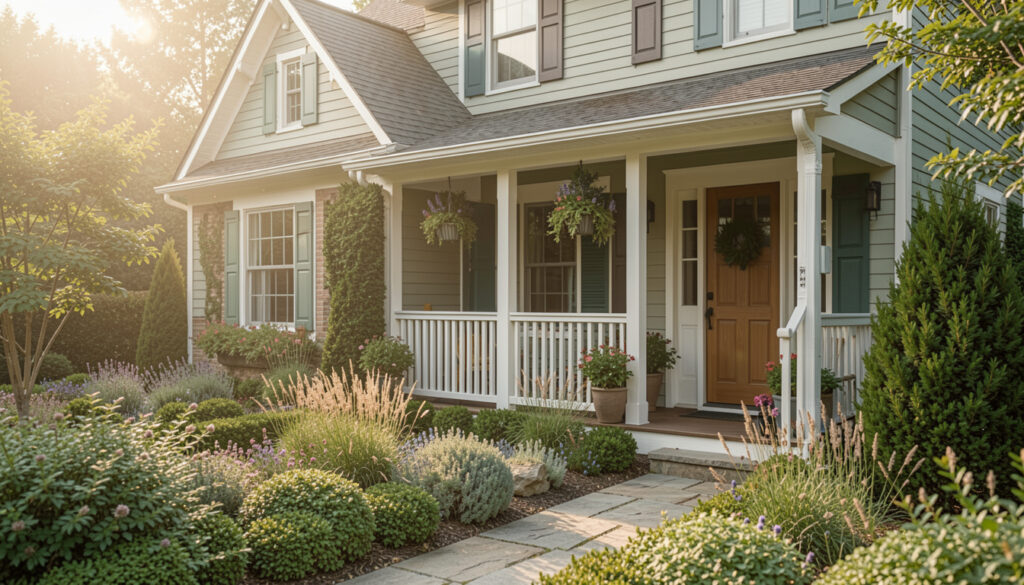
Green siding with white trim makes a house feel like it belongs in the landscape instead of standing apart from it. Choosing a mid-green keeps things from feeling too cottagey while still reading fresh and lively. Add planters or native shrubs to amplify the garden-forward vibe and soften hard edges. You can also swap in darker green shutters if you want subtle contrast without changing the whole palette.
Neutral Stucco with Warm Steps
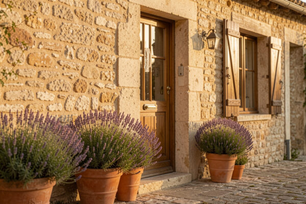
A neutral stucco body with warm-toned steps or a wooden entry offers a Mediterranean-inspired feel that’s easy to maintain. I remember choosing warm wood accents for my porch because I wanted the entrance to feel like a hug – it totally changed my perspective walking up to the house. Keep shutters and trim in a similar neutral to maintain a cohesive, calming look. Small exterior lighting near the steps can highlight the textures and make the entry feel intentional.
Fresh Green with Potted Accents
Bright green paint paired with white trim and lots of potted plants reads cheerful and curated. You can let the plants do some of the decorating work, making the exterior feel layered rather than painted-on. If you’re a plant person, try mixing textures and heights around the doorway to complement the green. Also consider a darker stain on doors or steps to anchor the brightness so it doesn’t overwhelm the eye.
Green Facade, Lush Window Boxes
Using green on the facade with plants spilling from window boxes creates a storybook look that’s surprisingly modern when paired with clean trim. A slightly muted or olive green tends to work well across seasons rather than clashing with autumn leaves or summer blooms. Focus on matching the undertones of your green to your roof and paving so everything feels deliberate. Window boxes also make great seasonal swaps if you like changing palettes without repainting.
Soft Pastel with Simple Landscaping
Pastel exteriors, like a soft sage or dusty blue, can look sophisticated when paired with restrained landscaping. I used this approach on a rental property and it was the fastest way to make the place feel warm and lived-in without spending a fortune. Keep porches uncluttered and pick two accent colors maximum to keep the look serene. If you worry about trends, go a touch deeper than the palest pastel so it ages better.
Floral Front, Colorful Borders
When flowers are part of the picture, a soft neutral exterior acts like a canvas for seasonal bursts of color. Use planters or flower beds that echo tones from your trim or door to create a coordinated feel. Mixing annuals and perennials keeps it interesting year after year without repainting. Also think about how porch furniture colors will interact with the garden palette so everything reads as one scene.
Classic Blue with Natural Hedges
Classic blue siding with neat hedges feels calm and structured in a very friendly way. I once volunteered to help a neighbor repaint and choosing this blue made their colonial feel both fresh and timeless. Keep window frames lighter to brighten the face of the house and avoid a boxy look. If you want a coastal vibe, add rope or wicker accents that play off the blue tone.
Blue and White, Clean Lines
Blue with white trim is a crisp combo that reads well on both modern and traditional homes. Choose a mid-blue to keep dirt and fading less obvious while still maintaining a fresh contrast with the white. For a subtle update, paint only shutters and the door and leave the body neutral; that gives you color without committing to full siding paint. Lighting and hardware finishes can push the look toward farmhouse, coastal, or contemporary depending on your taste.
Green with Warm Wood Door
A deep green body with a wooden front door feels cozy and handmade, like a curated cabin in the suburbs. I personally fell in love with this combo because the warmth of the wood makes green feel less trendy and more rooted. Accent the doorway with matching planters or metal house numbers for continuity. If privacy is important, darker tones will hide scuffs better and create a snug curb presence.
Garden Green with Flower Beds
When the green on your house echoes the garden beds, the whole property reads like one thoughtfully composed scene. Choosing similar hues avoids visual competition and instead creates a peaceful, immersive look. Try to match undertones – warm greens pair better with terracotta and warm wood, while cool greens suit stone and metal accents. Seasonal planting will allow the look to evolve without repainting, which is perfect for patient gardeners.
Earthy Brown, Clean White Trim
Brown siding with white trim can feel unexpectedly modern when you choose a rich, slightly warmed brown and bright white. I recommended this combo to someone who wanted a minimalist vibe but also durability, and it read as simple and very grounded. Add textured elements like a woven welcome mat or natural stone to prevent the palette from being too flat. If you want a pop, introduce that color on a door or small accent rather than the whole facade.
How to Actually Make This Work For You
Start by photographing your house at different times of day and pinning the palettes you love next to those photos so you can visualize each choice in context; then test colors with peel-and-stick swatches or a small painted board against the wall to see how light affects them. Consider the fixed elements like roof color, stone, and driveway before making a final pick because those will anchor the entire palette, and finally pick one accent – a door, shutters, or planters – to be your color risk so you don’t overwhelm the whole exterior.
How do I choose a paint undertone?
Look at your house materials in natural light and compare small paint chips against them – warm undertones pair with tan or red brick while cool undertones marry stone and gray shingles better. Test large swatches on the wall to see how the undertone shifts during the day before committing.
What if I only want to change the door?
Changing just the door is a low-risk, high-reward move that refreshes curb appeal instantly and is easy to reverse if you get tired of it. Pick a color that complements your siding and trim, and use hardware and a doormat to echo that choice.
Will dark colors make my house hotter?
Dark exteriors can absorb more heat but effects vary by material and climate; metal roofs and certain siding can show more temperature change than lighter materials. In cooler climates, a darker shade can add cozy curb appeal without significant downsides, while in hot regions you might prefer mid-tone neutrals for comfort and longevity.
How much should I test before painting?
Always test at least two large swatches on different walls and observe them over several days to account for morning and evening light differences. If possible, test on an inconspicuous area first and live with it for a week to check how it reads with landscaping and neighboring houses.