Okay, picture this – you pull up to your house and wish the outside matched the cozy vibe inside, but your bank account says no big renovations. If you’re thinking about home exterior colors on a budget, you’re in the right spot.
I made this guide because I spent a summer testing cheap paint samples, swapping trim colors, and learning what actually makes a small budget look intentional. I want to save you the trial and error I lived through – trust me, I learned a lot from a single $4 sample pot.
Read on and you’ll get 25 real ideas, quick tips for saving, and simple swaps that change curb appeal without breaking the bank.
These 25 Home Exterior Colors On A Budget Will Inspire You
Clean White Brick Charm
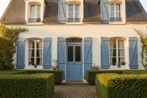
White brick feels fresh and timeless, and repainting brick with masonry paint can be done on a weekend if you prep properly. I used a tinted primer on a chilly morning and the final coat hid years of dirt better than I expected. You can pair white brick with low-cost black or green accents for an elevated look without fancy materials.
Moody Black Cottage
Black exterior paint makes a small house feel dramatic and modern, and one gallon of high-quality exterior paint goes surprisingly far on trim and doors. When I painted my friend’s tiny cottage black, we used leftover porch paint for touch-ups and still stayed under budget. Add white window frames and plants to soften the contrast.
Landscaped Neutral Classic
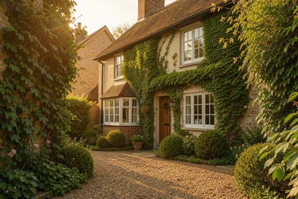
Neutral tans and greiges blend beautifully with mature landscaping and make any entryway feel welcoming. I once chose a warm greige because it matched the stone steps, and neighbors kept asking who redesigned the front yard. Simple color continuity between siding and hardscape is a cheap trick that reads expensive.
Walkway-Friendly Warm Tones
Choosing a warm exterior tone helps hide grime on high-traffic facades and keeps things feeling cozy in cooler months. You can repaint just the lower half of the house or the trim to test a warm tone before committing to a full repaint. Pair it with inexpensive solar pathway lights and your walkway suddenly feels intentional.
Blue Trim Pop
A blue house with white trim is classic, but you can get the same charm by painting just shutters and doors a bright blue. I painted my stoop in a sample blue and got so many compliments that we ended up doing the shutters too. Small pops are budget-friendly and easy to reverse if you change your mind.
Earthy Brown Blend
Brown tones read natural and blend into wooded yards without calling attention to imperfections in siding. A single coat of stain or paint in an earthy brown revived an old ranch in my neighborhood, and the owner only paid for targeted touch-ups. Keep hardware consistent and the whole look feels intentional.
White With Pink Door
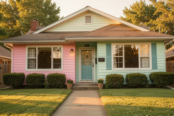
Painting a door a playful color like pink instantly adds personality while leaving the rest of the house neutral and affordable to maintain. I once used leftover cabinet paint for a door and saved nearly half the usual cost – it brightened the whole facade. Pair with a seasonal wreath and you’re done.
Green Door Statement
A deep green door feels classic against any neutral siding and potted plants make it read inviting. You can achieve a high-end vibe by just swapping out the doorknob and painting the frame, which I did one rainy afternoon. Two matching planters frame the entrance and make a small investment pop.
White Trim On Brown
Brown siding with crisp white trim creates contrast that looks clean and intentional; trimming out windows only is a low-cost way to get this effect. I tested trim color with painter’s tape before committing, and that saved me from redoing the whole house. White accents lift darker bodies and feel fresh year-round.
Green With Front Pots
A green exterior paired with potted plants makes a cottage look lively without expensive landscaping. I bought secondhand planters and filled them with cheap perennials – the curb appeal improvement was immediate. Choose a green that complements your lawn and you’ll hide dust and pollen better than with white.
Flower-Powered Facade
Lots of flowers in the front yard can make even basic paint choices feel curated, and you can plant bulbs for seasonal color on a tight budget. I planted a strip of annuals last spring and the house suddenly felt staged for free. Strategic planting pairs especially well with muted paint tones.
Black With Green Accents
Black siding with green or wooden accents reads luxe, and painting only the trim and shutters is an affordable way to try it. I used this combo on a rental exterior and renters loved the vibe, which made it easy to justify the small upgrade. Add lots of greenery to break up the drama.
Deck Color Injection
Sometimes your deck or porch furniture gives you the color palette without repainting the whole house – bold cushions can change the perceived exterior color temperature. I swapped out two chairs for colorful loungers and neighbors asked if I’d repainted. This trick is easily reversible and wallet-friendly.
Blue Porch Cozy
A soft blue on porch ceilings and doors is a Southern classic that doesn’t cost much but adds charm. I painted our porch ceiling in a sky-blue sample and fell in love with the calming effect every time I came home. Small, consistent blue details keep the look cohesive.
Green With Window Frames
Painting window frames a complementary color is subtler than changing the whole body color and much cheaper. Consider a dark green on frames if your house is light-colored to create depth without a full repaint. I did this after scraping peeling paint and it disguised flaws beautifully.
Family-Friendly Entryway
When you have kids, choose forgiving exterior hues like warm grays and mid-tone blues that hide little scuffs and play stains. We went with a mid-gray for our entry and it survived muddy feet and paint-splashing craft days. Practical choices can still look polished.
Small House, Big Impact
For tiny homes, choose one strong accent color for doors or shutters and keep the body simple – it creates a focal point without a lot of paint. I once helped a neighbor paint her bungalow’s trim bright coral and it transformed the whole street’s vibe. Small surfaces = small cost, big change.
Simple White Symmetry
All-white exteriors read clean and classic, and if you’re on a budget you can focus on pressure washing and touch-ups rather than full repainting. I rented a pressure washer for a day and the cost was less than a single professional paint touch-up. Fresh surfaces make inexpensive paint look better.
Gray With Flag Detail
Gray exteriors are forgiving and modern, and adding a small accent like a flag or wreath gives personality without much expense. We reused seasonal decor from inside to stage the porch and it felt instantly finished. Gray works well with both bold and neutral accents.
Two-Tone Porch Design
Two-tone paint schemes, such as a darker base with lighter upper trim, hide dirt and create visual interest cheaply. I painted the lower half of our cottage darker to hide splash marks and it made the upper details pop. This approach is forgiving when you only repaint sections over time.
Planters And Porch Lights
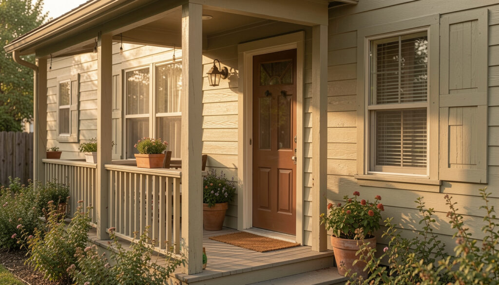
Sometimes hardware and thoughtful planters do more than paint – swapping an old light fixture and adding planters frames the entry beautifully. I replaced a dated fixture for under $50 and it changed how the whole house read in the evening. These small swaps pair well with subtle color changes.
Green Shutter Accent
Green shutters on a white house create a cottage feel; painting shutters is quick and affordable even if you hire a pro for the ladder time. I borrowed a ladder and finished both shutters in a morning, and the house looked decades fresher. Dark greens especially hide wear and look intentional.
Stone Steps, Soft Green
When your entry has stone steps, use a soft green or blue on the door to complement natural materials and avoid repainting large surfaces. I matched a sample pot to the stone’s undertone and it felt perfectly coordinated. This pairing reads thoughtful without much effort.
Neutral With Stone Accents
Large houses with stone steps look grounded when the body is a neutral, letting the stone do the heavy lifting for curb appeal. I advised a friend to pick a warm taupe and focus budget on cleaning the stone – the results were stunning. Use materials you already have to guide color choices.
How to Actually Make This Work For You
Start small and test – buy sample pots or use temporary vinyl accents to live with a color before committing, and prioritize areas people notice most like doors, shutters, and trim. Clean surfaces, repair any rotten wood, and then layer color and inexpensive accents like planters or updated hardware so the investment feels intentional rather than piecemeal.
How do I choose the right shade on a budget?
Pick two samples and paint large swatches near the front so you can see them in different light, then live with the swatches for a week – this helps you avoid costly mistakes. I always test in morning and evening because colors can shift dramatically between sun and shade.
Can I paint over brick or stone affordably?
Yes – masonry paint and a solid primer will cover brick, but preparation is key so the finish lasts; pressure washing and a masonry primer are worth the investment. If you want to reverse it later, consider limewash or breathable paints that moisturize rather than seal the material permanently.
What are the fastest ways to boost curb appeal?
Swap the front door color, add coordinated planters, and replace or paint light fixtures – these are low-cost changes with high visual impact. I once did all three in a weekend and neighbors were shocked by the difference.
How can I keep costs down while still getting a professional look?
Buy high-quality paint for your focal points and use budget-friendly options on less visible areas, and always prep surfaces thoroughly – good prep saves money in the long run. Also, tackle projects in clear weather weekends to avoid rushed fixes and extra expenses.