Okay, real talk – choosing home exterior colors combinations for beginners felt overwhelming the first time I tackled it. I remember staring at swatches for hours and wondering what would actually look good in real life.
I made this article because I wish someone had handed me a friendly, visual list when I started – so I tried out lots of combos and learned what works fast. I’ve painted a tiny cottage and tested accent doors, so these examples come from actual trial and error.
Below you’ll find 20 easy-to-follow color combos with photos and notes so you can pick a palette that actually feels like home.
These 20 Home Exterior Colors Combinations For Beginners
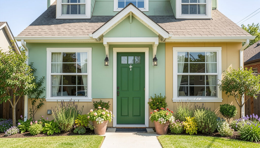
Green Door, Neutral Body
This pairing shows how a bold green door pops against a calm, neutral siding. I painted a cottage door a similar green once and it instantly felt more charming – the green invites people in without overpowering other details. It’s a safe first step for beginners who want personality with minimal risk.
Stone Steps, Warm Tones
Stone and warm paint tones are timeless because the stone anchors the palette while warm hues add cozy character. I love this look on homes with architectural lines, since the texture of stone breaks up large expanses of color. Try warm taupes or soft terracotta if you want something inviting that ages well.
Green Siding With White Trim
Green siding paired with crisp white trim feels fresh and classic at the same time. When I first moved into my place I used white trim to make darker siding feel lighter and it gave the whole house a cleaner look. This combo is beginner-friendly because white makes everything read sharper and easier to match with accessories.
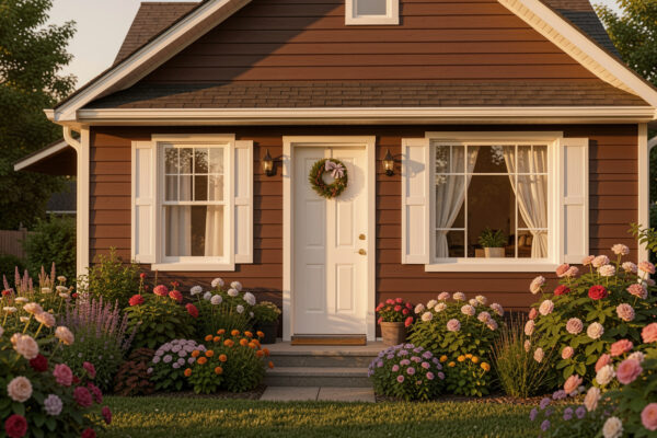
Bold Red, Bright Trim
A red body with bright white trim is dramatic but beginner-friendly since high contrast hides small mistakes. I’ll be honest – red intimidated me at first, but once I saw it in daylight I was hooked. Consider scale: on smaller homes this looks playful, while on larger ones it reads stately and traditional.
Modern Neutrals With Stone
Neutral paint mixed with stone accents creates a contemporary, layered exterior that still feels approachable. I used a similar scheme on a rental and it added perceived value without being trendy. It’s a great pick if you want clean lines and an easy-to-shop palette.
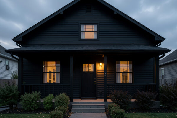
Gray Body, White Trim Light
Soft gray siding with white trim reads modern and calm, especially at dusk when lights come on. I remember choosing this combo because it looked good on photos and in person, and it never felt dated. Pair it with warm wood accents to keep the look cozy rather than sterile.
Earthy Green, Lush Planters
Green exteriors paired with lots of plantings blend the house into its landscape beautifully and feel forgiving of small imperfections. I planted pots after painting and the colors felt more integrated immediately. For beginners, matching paint to dominant foliage tones is an easy win.
Green Siding With Nice Fixtures
Adding classic fixtures against green siding gives the exterior instant polish and makes the color feel intentional. I swapped out old lights for brass ones during a weekend refresh and it elevated the whole look. Little hardware swaps like these are simple ways to sell a color choice.
Red Exterior With Stone Steps
Red siding combined with natural stone steps looks warm and grounded, especially in cooler climates. I once saw a farmhouse painted this way and it felt both cheerful and historic. If you love bold color, anchor it with neutral masonry to keep things balanced.
Windowed Facade With Green Accents
Lots of windows paired with soft green accents read airy and intentional, which is perfect if you want a fresh, welcoming curb. I painted shutters a muted green for a friend and the difference was immediate in photos. Consider how your window trim color changes with indoor lighting before committing.
Porch-Centric Neutral Plan
This rendering shows how neutral bodies with a subtle contrasting trim highlight porch details rather than overwhelm them. When I focused on porch color accents, guests kept commenting on how cozy the entrance felt. That feedback convinced me that small color choices can have big impact.
Green Door, Porch Vibes
A rocker on the porch plus a green door gives instant cottage charm without much effort. I actually spilled paint on my boots painting a porch chair once – worth it for the cozy results. Start small like this and you’ll see how a single color can define the whole entry.
Landscape-Forward Neutrals
When landscaping is strong, neutral house colors let plants be the star and reduce visual competition. I walked a few neighborhoods to see how greenery and paint played together before picking my palette. If you’re new to exterior color, lean on the landscape — it’ll make decisions easier.
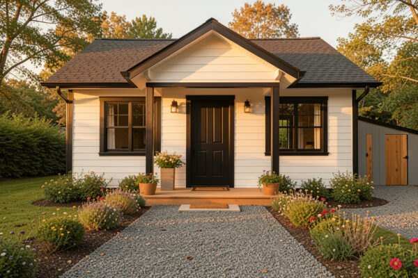
Classic Gray With White Trim
Gray with white trim is a safe go-to because it reads modern without feeling cold when you pick warm gray tones. I used this combo on a rental and renters loved the neutral backdrop. Add color through plants or a painted door to avoid monotony.
Green Building With Living Accents
When plants climb up a facade, pairing the building’s color with living greenery feels cohesive and relaxed. I once tended to window boxes that made my chosen paint feel richer without extra cost. If you want low-commitment changes, plants help mute and elevate your paint choices.
White Body, Red Roof Pop
A white house with a red roof reads bright and iconic, especially in minimalist landscapes. I visited a coastal town that used this combo and the homes felt cheerful even on cloudy days. For beginners, contrast between roof and body is an easy way to define style from afar.
Gray Front, Clean Trim
Using mid-gray for the body and crisp trim lets architectural details shine without fuss. I painted my trim one shade lighter and it instantly sharpened window and door frames. Experiment with three swatches in natural light before deciding.
Soft Patio, Gentle Hues
Patio views benefit from gentle, neutral exteriors that don’t fight backyard colors. When I chose a soft palette around our patio, outdoor cushions suddenly looked intentional. This approach helps outdoor living areas feel integrated and peaceful.
Large Green Home Elegance
On larger homes, deep green with white accents amplifies drama while staying grounded in traditional style. I admired a similar house on my commute and felt inspired to try bolder colors; scale changes how the color reads. If your home is sizable, don’t shy away from richer tones.
Lavender Gardens, Soft Facade
When you have dominant landscaping like lavender, choose exterior hues that harmonize rather than compete. I once coordinated my paint to a friend’s garden and her curb appeal improved overnight. Matching your exterior to garden tones can create a picture-perfect look without much fuss.
How to Actually Make This Work For You
Start by testing small – paint door or trim samples and look at them morning and evening, because light changes everything and real-life observation beats swatches. Consider your roof, stone, and landscaping as partners, not afterthoughts, and pick one accent color to repeat across hardware or planters for cohesion; this makes decisions easier and keeps your exterior feeling intentional.
How do I pick colors that won’t look dated?
Answer – Choose classic neutrals for large surfaces and reserve bold accents for doors or shutters; this way you can update the accent without repainting the whole house. Also sample colors in real light over several days before committing.
What should I test before a full paint job?
Answer – Always paint 2-3 large test patches on different sides of the house and observe them at different times of day. That helps you avoid surprises from light shifts or neighboring reflections.
Can I mix warm and cool colors successfully?
Answer – Yes – anchor the mix with a neutral base and use warm or cool tones as accents so they complement rather than compete. Balance is key, and small elements like trim or planters are good places to experiment.
How do I coordinate with stone or brick?
Answer – Pull a dominant undertone from the stone or brick and choose paint colors with similar warm or cool undertones, which creates a cohesive look without exact matching. Undertone harmony ensures materials read as part of the same palette.