Hey friend, if you have a tiny home or a compact lot and want it to feel bigger before you even step inside, exterior home color schemes for small spaces can be a total game changer. Choosing the right palette is like giving your house a personality that plays well with scale and light.
I wrote this because I spent a summer repainting my own small bungalow and learned a few tricks the slightly hard way – but the results were so worth it. I want to save you time and paint splatters by sharing palettes that actually work for cozy exteriors.
Read on and you will find ten real color combos, styling notes, and practical tips so you can pick one that makes your small space feel open, charming, and totally you.
These 10 exterior home color schemes for small spaces
Soft White with Warm Trim
White siding with a warm, creamy trim is a classic for a reason – it brightens shadows and visually enlarges the facade. I love this when the yard is modest because the white reflects light into windows and makes the whole place feel airy. Adding stone steps or a textured walkway gives subtle depth so the white never looks flat.
Charming Cottage Green
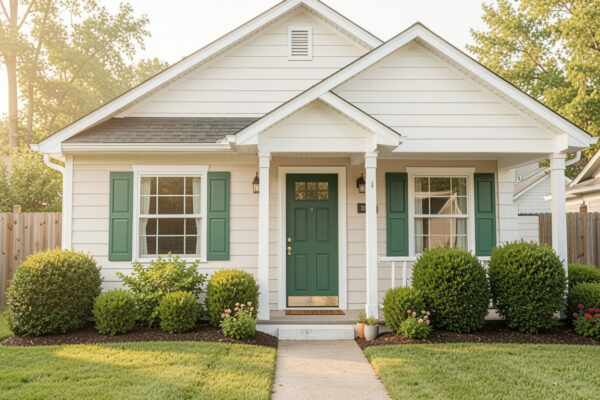
A gentle, muted green on the walls paired with crisp white trim gives instant curb appeal and blends with surrounding plants. This palette works especially well if you have a small garden because it ties the house into the landscape. I painted my own door a deep green once and neighbors stopped to compliment the warmth it added.
Brick Accent and Black Trim
Let brick be the hero and keep surrounding siding neutral – warm taupes or soft greys let the brick speak without overwhelming. The black windows and trim add modern contrast and make the architecture read cleaner from the street. Keep landscaping simple so the eye is drawn to texture instead of clutter.
Monochrome Calm Grey
A layered grey palette with slightly varied tones on siding, trim, and door creates depth while staying cohesive. If you choose warm greys they reflect light gently, but cool greys can feel contemporary and crisp. Try painting the door a darker shade to anchor the composition without shrinking the overall effect.
Olive Green with Natural Accents
Deep olive on clapboard with natural wood or stone accents makes a small house feel grounded and intentional. Because green sits near the middle of the color spectrum it harmonizes with foliage so your yard reads as an extension of the design. I remember feeling instantly calmer after switching to olive because it hides seasonal grime beautifully.
Green Facade with Window Gardens
Painting the exterior a muted green and adding plants around windows creates layers that distract from scale limits in the best way. Vertical planters and climbing vines make walls feel textured, and you can mask any awkward proportions easily. You can also experiment with window boxes in complementary tones for a cheerful pop.
Two-Tone Green and White Balance
Split the house visually with green lower walls and bright white upper trim to lift the roofline and visually increase height. This trick is great if you want your small home to feel taller without structural changes. When I used this on a rental property the whole step-up in perceived scale surprised even me.
Artist Rendered Pastel Porch
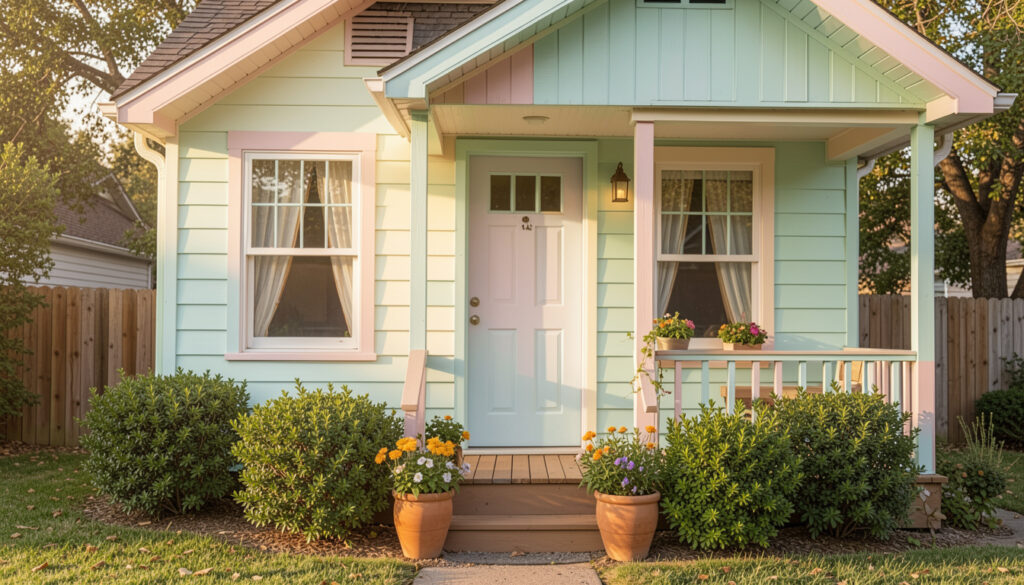
Soft pastels on porches and stairs paired with neutral body colors create a welcoming focal point rather than competing visual mass. An illustrated concept like this helps you plan mood before buying paint, because the tonal relationships are easier to test digitally. Start small with a sample pot and live with it for a week before committing.
Greenery Surround and Cottage Florals
Softer exterior hues like sage or mint paired with abundant shrubs and flower beds make the house feel tucked-in and cozy rather than cramped. The plants create transition zones so your facade reads as part of a layered scene instead of a flat box. I used planters to mask a narrow side yard and it instantly felt purposeful and charming.
Bold Door, Simple Walls
Keep siding neutral and make the front door a statement in emerald, navy, or tomato red to draw the eye and add personality. Two large planters flanking the entrance amplify the focal point and give a sense of symmetry that reads larger. If you have one small tip from me – choose a durable finish for that door so the color stays vivid through seasons.
How to Actually Make This Work For You
First, test paint samples at different times of day on the largest wall you have because light changes everything and small homes show it more clearly. Next, simplify your trim and hardware so the eye has fewer competing elements – simple contrast usually reads as larger. Finally, use landscaping and textures like stone, wood, or plantings to break up flat expanses and give depth without adding bulk.
How do I pick between warm and cool neutrals?
Think about the direction your house faces and the seasonality of light – warm neutrals suit golden afternoon sun while cool neutrals work with northern exposure. Try swatches on multiple walls and observe them across at least two days to see which mood fits your neighborhood and personal style.
Will dark colors make my small house look smaller?
Dark colors can feel cozy rather than small if used thoughtfully, especially when paired with lighter trim or reflective accents. You can use dark hues on lower sections or doors to create anchor points while keeping the main body lighter to maintain openness.
Can I mix materials like brick and paint on a compact home?
Yes – mixing materials adds texture and helps break up scale, but keep the palette unified so the combination feels intentional. Use a dominant color linking both materials or repeat a trim color to create harmony across surfaces.
How much does landscaping affect perceived size?
Landscaping is hugely important – layered plantings and vertical elements draw the eye upward and create depth, which visually enlarges small properties. Even simple planters and a neat pathway can shift perception significantly if placed to guide sightlines intentionally.