I love peeking at tiny houses and imagining how a little tweak in paint would totally change the vibe – especially when space is tight. If you’re searching for home exterior colors combinations for small spaces, you’re in the right place to get ideas that actually work.
I made this because when I moved into my first compact bungalow I felt overwhelmed by choices, and trial and error cost me time and paint money. Over the years I found palettes that make small facades feel airy, bold, and welcoming without feeling cramped.
You’ll get 12 real combinations with photos to inspire you and practical notes from what I learned painting, styling, and living with each look.
These 12 Home Exterior Colors Combinations For Small Spaces You Can Copy
Fresh Green Cottage Charm
This sweet green cottage look feels like a little hug from the curb – the color blends beautifully with flowering beds and a stone path. I found that pairing a mid-tone green with crisp white trim makes a narrow facade appear taller. If you add lots of front-yard plants, the palette reads like a single composition and your tiny house will feel lush and intentional.
Vertical Green Accents
Taller windows with climbing plants and darker green siding give the illusion of height, and you can emphasize that with slim vertical trim. I once encouraged a friend to paint her townhome’s shutters in a deeper green, and neighbors thought the house had an extra story. Try this if your lot is narrow and you want plants to feel like part of the architecture.
Playful Purple Porches
A soft purple can be surprisingly flattering on a small house, especially when balanced with white railings and light wood accents. I remember painting my balcony rails in a muted lavender and suddenly my tiny front porch felt like a secret garden spot. Use this on trims or doors first if you’re nervous, because pops of purple read whimsical not overwhelming in compact spaces.
High-Contrast Modern Minimal
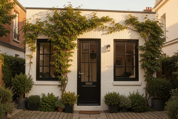
For a modern tiny home the black and white approach is crisp and clean, and it helps the eye skip over cluttered details. I recommend high-contrast combos when your architecture is simple – they make lines look sharper and the whole thing appear elevated. You can soften the intensity with warm landscaping stones or wood planters.
Garden-Ready Green With Pots
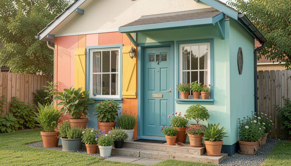
Potted plants really sell green exteriors, and a mid-green body color paired with natural pot terracotta feels effortless. When I moved into a tiny rental, potted ferns and succulents made it feel like a curated front room. If you want a welcoming entry without big landscaping, choose a green that blends with your planters for a cohesive curb feel.
Soft Gray And Bright Trim
Gray siding with white trim is a classic small-space trick because it reads calm and broadens the visual field. My first gray paint job made the narrow side yard feel less tight, and a lighter shade was key. Use white trim on gutters and window frames to add crispness without shrinking your home.
Green And White Layered Lighting
Green siding and white trim paired with interesting light fixtures can create depth that tricks the eye into thinking the facade is larger. I swapped plain lights for taller sconces and the whole entrance felt more dimensional at dusk. Consider warm bulbs so the green reads softer after sunset.
Bold Door, Quiet Walls
A green door with neutral walls and large planters creates an inviting focal point without covering the whole house in color. I painted my own tiny entry a saturated green once and the house suddenly had personality without feeling busy. That single splash works great when square footage limits decorative options.
Layered Landscaping And Steps
Steps and layered planting beds give depth to a small frontage so color changes feel intentional rather than cramped. I noticed that homes with purposeful steps and mixed plants can carry stronger hues without seeming overpowering. Match the stair material with trim tones to create a seamless transition from path to facade.
Cozy Patio Neutrals
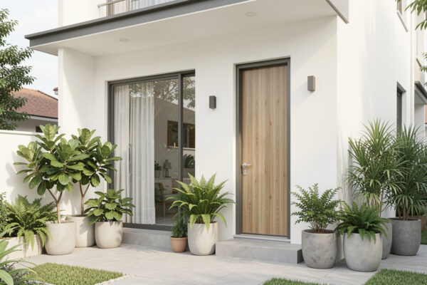
Neutral exteriors paired with warm patio accents make a small outdoor area feel like an extension of the living room. On my tiny back patio I used taupe walls and cream seating, so the space felt larger and more cohesive. If your lot is compact, think of the patio colors as part of the home’s palette to avoid visual breaks.
Warm Steps And Doorway Tones
When your house has steps up to the door, using a warmer hue on the door and neutral steps can make the elevation feel less imposing. I helped my sister pick an earthy orange for her entry and it softened the whole approach, especially on cloudy days. This combo is perfect when you want the door to read cheerful without the entire exterior competing for attention.
Green House With a Pop
Greens with a contrasting door color like burnt orange create a playful yet balanced palette for compact homes. I once suggested an orange door to a neighbor who feared color – the result felt bold but friendly. When small spaces use a restrained main color and a single accent, the overall effect is confident and charming.
How to Actually Make This Work For You
Start by testing swatches on the wall at different times of day so the color reads correctly under sunlight and shade; small houses show undertones more clearly, so watch for pinks or blues that change your vibe. Secondly, pick one strong focal accent like a door or porch trim and keep other elements neutral to avoid visual clutter – planting, hardware, and lighting should complement that focal hue. Finally, imagine the whole block and choose a shade that harmonizes with neighboring homes while letting your house still speak for itself.
How do I choose a color that makes my house look bigger?
Choose lighter, cooler hues and minimize contrasting trim lines to create an expanded feeling – soft grays, pale blues, and muted greens are excellent. Reflective surfaces like white trim or light stone can help bounce light and reduce visual weight.
Will a dark color make my small home look too closed in?
A dark color can work if balanced with bright trim and reflective elements like glass, metal, or light landscaping, which add contrast without shrinking the appearance. Use dark shades as accents or on lower sections to ground the home instead of covering every surface.
Should I match my front door to the trim or the body?
Make the front door a focal piece by choosing a contrasting yet complementary color to the body and trim – it creates personality without overwhelming. If you prefer subtlety, select a slightly deeper or lighter shade within the same family as the body color.
How much does landscaping affect color perception?
Landscaping dramatically changes how paint reads, since greens and blooms add warmth and texture that either amplify or soften your chosen palette. Planters and groundcover can be used like accessories to reinforce the color story you want from the curb.