I seriously get it – choosing home exterior colors for beginners feels overwhelming and kind of permanent, and you want it to look like “you” while still being safe. Picking paint felt like a huge decision when I first moved into a fixer-upper, so I’m writing this like I’m sitting with you over coffee.
This article exists because I wish someone had given me a simple, friendly roadmap when I was staring at 50 paint swatches, and I actually learned so much by making a few mistakes that taught me quicker than any Pinterest habit could. I mixed neutral tests, watched how light changed tones across the day, and ended up with a palette I loved.
You’ll get ten easy color ideas, real-life tips, and quick dos and don’ts so you can choose confidently without the stress.
These 10 Home Exterior Colors For Beginners You Will Love
Soft Warm Beige
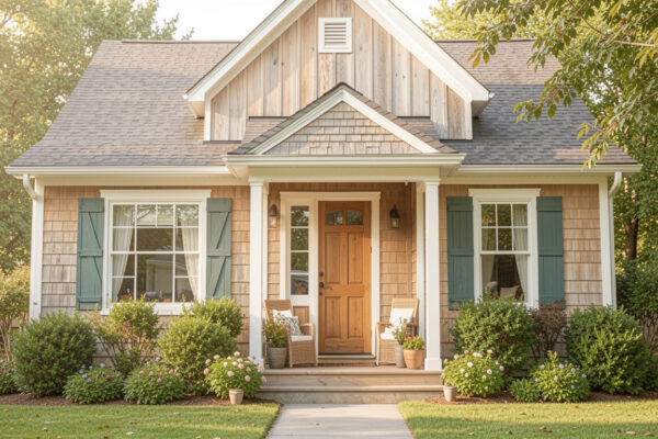
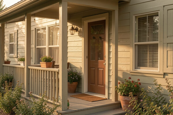
Soft warm beige is a forgiving choice that hides minor imperfections and blends well with greenery, which makes it perfect if you have a casual garden or cottage vibe. I once painted a rental in a very similar tone and it made the whole place feel brighter without screaming for attention. If you like a safe, welcoming look, this color will make your home feel cozy and timeless.
Classic Gray With White Trim
Classic gray with crisp white trim is modern and endlessly chic, which is why so many new builds and renovations lean into it; the gray gives structure while white trim adds that neat, finished feeling. When I tested grays at my place, I noticed some shades read blue in cool light and taupe in warm evenings, so view samples in morning and late afternoon. You can easily layer darker hardware or shutters to add contrast and personality without risking the overall neutral vibe.
Muted Slate Blue
Muted slate blue is quietly charming and adds character without feeling loud, and it pairs beautifully with natural wood accents or black fixtures. I remember falling for a slate-blue façade on a weekend drive and thinking how calm it felt against green shrubs, which inspired a subtle blue accent on my own front door later. You can go slightly darker on doors and trim to make the lines pop against softer siding tones.
Crisp Navy Accent
Crisp navy as an accent color is an easy way to add drama without committing to a full dark exterior, and it looks stunning on shutters, doors, or a single feature wall. Try it if you like high contrast but still want a classic palette that won’t feel trendy in five years. Pairing navy with white or soft gray keeps things clean and approachable for most neighborhoods.
Warm Stone Gray
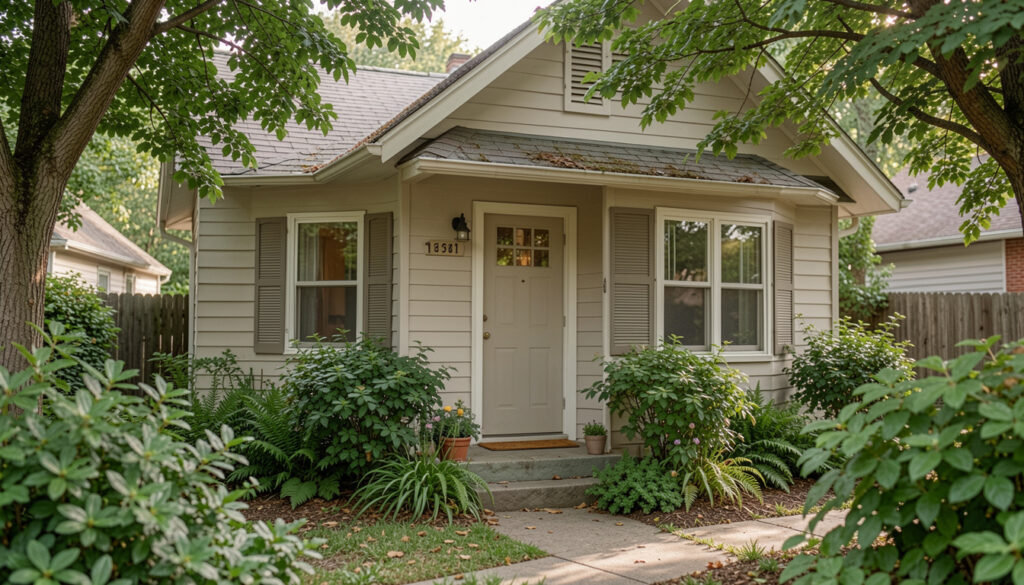
Warm stone gray feels natural and grounded, especially if your home has brick or stone details already, because it complements instead of competing with texture. One of my friends painted her bungalow in a warm stone gray and the overall effect was calming and cohesive with the landscaping, which made everyone on the block ask for her color codes. If you want an easy, elegant base, this is a smart pick that reads well in morning light.
Blue Front Door Pop
Choosing a blue front door for a pop of color is beginner-friendly because it’s inexpensive to change and gives instant curb appeal without repainting the whole house. I painted my door a saturated blue after hesitating for months, and the boost in confidence every time I pulled into the driveway was real. If you want a small, joyful update, a bold door color feels both personal and reversible – win-win.
Crisp White Brick
Crisp white brick is bright and clean, and it works especially well when you want a minimalist, fresh look without lots of color layering. On cooler, overcast days some whites can read flat, so choose a white with a hint of warmth if you want the façade to feel inviting rather than stark. Since brick has texture, the white finish still shows depth and interest even though the hue itself is neutral.
Stone With Blue Shutters
Stone exteriors paired with blue shutters give a charming, storybook feel that reads as both classic and curated, and it ties in greenery beautifully. One afternoon I stopped to take a photo of a house exactly like this because the combination of cool blue and warm stone felt so balanced in sunlight. If you want something with character that still feels approachable, this pairing nails it without being overwhelming.
Earthy Green Tones
Earthy green tones blend into gardened landscapes and suit homes that want a natural, cottage-like appearance, and they look amazing next to wooden decks or rust-colored accents. I recommend testing green swatches at different times because foliage can make some greens read more vibrant than they are in isolation. Choose muted, warm greens if you want a subtle, calming presence rather than a statement color.
Deep Forest Surround
Deep forest tones are perfect if your home is surrounded by trees and you prefer a moody, integrated look that feels like part of the landscape rather than standing apart from it. When I visited a cabin painted in a very dark green, the way the house almost disappeared among the pines felt cozy and very intentional. Use lighter trim and reflective hardware to keep the look from feeling too heavy while maintaining the dramatic, enveloping mood.
How to Actually Make This Work For You
Start small by testing a few large swatches on different walls and observe how they change across the day, and remember that siding material, sunlight, and neighboring colors will shift how any hue reads. Take photos at multiple times and invite a friend to give a fresh opinion, because a second pair of eyes often catches undertones you missed. Lastly, pick one element to be your anchor – a door, shutters, or trim – and experiment with that before committing to a full repaint.
How many paint samples should I test?
Test at least three to five large samples in different areas of your exterior – the more variety you try, the easier it is to see undertones and how light affects each option. Allow each sample to dry fully before judging the true color – wet paint looks different than dry paint.
What trim color works with most exteriors?
Soft white or warm white trim is generally the safest bet because it brightens edges and complements most base colors without clashing. If your siding is very warm-toned, choose a white with a faint warm undertone so the transition feels natural.
Can I mix two colors on my home?
Absolutely – using a primary neutral and a bolder accent creates depth and visual interest without overwhelming the design. Keep the ratio simple by letting the neutral dominate and using the accent for doors, shutters, or a single architectural feature.
How do I make sure the color fits the neighborhood?
Walk the block and take notes of common palettes and finishes, then choose a color that feels complementary but slightly elevated to reflect your personal style. If you live in a historic district, check local guidelines first so you avoid costly repaint orders later.