Hey, if you’ve been staring at your tiny home and wondering which home exterior colors in india for small spaces will actually make it look bigger and happier, you’re totally in the right place. I spent months pinning ideas and testing swatches on my own balcony wall, so I get how overwhelming the choices can feel.
I wrote this because I wanted a practical, friendly guide that actually speaks like a chat over chai, not a designer lecture. I tried several combinations on my house and on a neighbour’s compact rowhouse – so these picks come with real-world tiny-space experience.
Scroll through these 15 color ideas and you’ll find the mood, combo tips, and easy ways to test them before you paint anything permanent.
These 15 home exterior colors in india for small spaces
Warm Terracotta Charm
Terracotta paired with soft grey trims gives a grounded, earthy look that still feels contemporary, which is great for narrow street-facing homes. Use the orange tone on a single accent wall or parapet while keeping window frames in light grey – this keeps the profile crisp without feeling heavy. I once painted a small stoop in terracotta and noticed neighbours smiling more – it really brightened the whole lane.
Classic Brown and Cream
Brown and white or cream is a timeless combo that reads warm and elegant, perfect for compact homes where you want a calm, neutral backdrop. Keep the brown to lower portions or a fascia and paint the larger planes in cream to visually lift the structure. When you choose tones with similar warmth, the house feels cohesive instead of chopped up – something I always remind my sister when she overplans with too many contrasts.
Modern Grassland Rendering
A soft sage or muted green with off-white trims creates a modern but natural facade that blends with small front gardens or potted terraces. Green reflects foliage and can make a tiny frontage feel like an extension of your plants instead of a blocky structure. Try painting the door a slightly darker green to add depth without shrinking the overall look.
Playful Balcony Palette
When windows and balconies are part of the design, selective color blocking in muted hues helps define features without overwhelming a small facade. Pick one or two accent colors for balcony rails and shutters while keeping the main walls neutral; it keeps the eye moving and the house feeling larger. I love this trick on compact row homes because it gives personality while maintaining scale.
Sunny Paint Swatches Joy
Testing swatches directly on your wall is non-negotiable, especially in Indian daylight which can warm or bleach colors dramatically. Try three different swatches in morning and afternoon light to see how the tones shift before committing. This simple exercise saved me from a color I loved in the store but that read too harsh on my façade.
Vibrant Yet Grounded Duo
Bold colors like orange and green can be used in moderation – think a painted arch or an accent stripe – so the house feels lively without shrinking visually. Keep major planes neutral and reserve the saturated tones for architectural highlights. This is a great approach if you want your small home to stand out on a narrow street without feeling toy-like.
Purple Accent Delight
Deep purple or eggplant accents against a warm neutral base read sophisticated and quirky in small spaces. Limit purple to doorways or niche panels and combine with mustard or soft yellow highlights for an unexpected but balanced contrast. Use matte finishes to avoid glare that can make small walls look busier than they are.
Earthy Browns With Light Trim
Layering two shades of brown with white trim can make a narrow home feel warm and proportional rather than closed-in. Keep the darker shade lowest and lighter higher up to visually lift the facade. On a friend’s tiny flat, this trick added subtle depth and suddenly the building looked more intentional and finished.
Rowhouse Rainbow Balance
If you’re on a street with multiple small houses, coordinating palettes with neighbors can prevent a noisy block and actually make each home read larger. Choose a shared neutral and let individual houses add a single accent color each – it’s cooperative and charming. You’ll find the rhythm of color helps the eye travel, creating the illusion of space.
Pretty Pink Subtlety
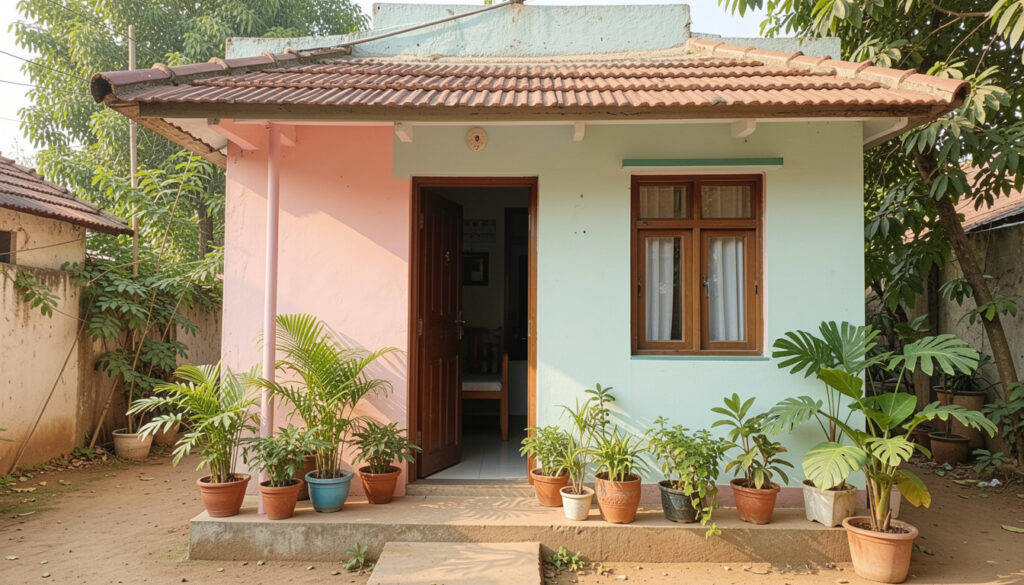
Soft blush or dusty pink on compact facades can feel fresh without being overly feminine, especially when paired with stone or wood elements. Use it as a main hue with crisp white trims, or vice versa if you worry about the pink reading too strong. Small planters and matching textiles add continuity and make the exterior feel thoughtfully styled.
Construction-Day Inspiration
When a house is under construction, deciding on exterior color early helps coordinate materials like tiles and railings. Keep samples on site so you can view them against actual cement and metal finishes rather than in a showroom. I learned this during my first paint project – seeing the paint next to raw bricks changed my whole plan.
Multi-Toned Balcony Fun
Using two complementary tones for balconies and trims adds character without reducing perceived space, because the main wall remains light and continuous. Consider a slightly darker color for the balcony floor to anchor the look, and keep vertical elements lighter to elongate. This technique looks particularly nice on narrow facades with vertical windows.
Neutral Brown-Beige Harmony
Layering beige and warm browns in subtle gradations gives a small exterior a calming, boutique feel without fuss. Keep textures minimal and add interest with a textured plaster or wood cladding in one small area. I used a similar palette on a tiny guest cottage and the result felt cozy yet unexpectedly spacious.
Coastal Blue Airiness
Blue and white is a classic combo that instantly introduces an airy, open feeling to compact homes, especially in coastal or humid regions of India. Use sky or powder blues with crisp white trims to reflect light and draw the eye outward. Pairing with terracotta pots and natural fibers creates a relaxed, vacation-like vibe right at home.
Tropical Pink And Red
Bolder pinks with deep red accents can read playful and dramatic together if used sparingly on small exteriors. Concentrate the saturated tones on focal points like an entrance or a porch beam so the rest of the facade can remain calm. In towns with lots of greenery, the colors pop without making the house feel cramped.
How to Actually Make This Work For You
Start with small tests: paint sample swatches in different areas that catch morning and evening light, photograph them, and live with those samples for a week before choosing the final color. Consider the scale of architectural features and let the largest wall remain lighter to visually expand the house, while reserving stronger hues for trims, doors, or a single accent wall – practical decisions like these prevent costly repainting. Finally, think about finishes and maintenance – satin or low-sheen paints hide imperfections and are easier to clean in busy urban Indian environments, so factor that into your selection.
How do I pick a color that suits Indian sunlight?
Test paint chips on the actual wall and observe them at different times of the day to see how warm or cool they look – natural light changes the tone dramatically. Choose slightly cooler neutrals if your home faces sun most of the day, and warmer neutrals for shaded facades – this keeps the color balanced and flattering.
Will bright colors make my small house look smaller?
Bright colors can feel bold but they don’t have to shrink a house if used as accents rather than covering all large surfaces. Keep main walls in lighter neutrals and introduce bright hues on doors, trims, or a feature band to maintain openness and personality.
What finishes work best for exteriors in India?
Choose weather-resistant emulsions with mildew and UV protection, and prefer low to medium sheen for exteriors – they are easier to maintain and reflect sunlight gently. Textured finishes can hide minor wall imperfections, while smooth finishes give a cleaner, modern look if your walls are even.
How can I coordinate with neighbours on a narrow street?
Start a friendly conversation and propose a shared palette or a simple rule like “one neutral + one accent” so the street reads cohesive rather than chaotic. This cooperative approach often results in a more harmonious look for everyone and can even increase the curb appeal of the whole block.